13 Web Design Trends to Watch in 2017
The landscape of web design trends is constantly evolving. Check out this 13 Web Design Trends to Watch in 2017 from Hubspot.
Something that looked modern and fresh yesterday can appear dated seemingly overnight, and trends once dismissed as irrevocably passé can unexpectedly cycle back in vogue.
With that said, to help you prepare for wherever the web design tide takes us in 2017, we’ve put together a list of 13 trends to keep a close eye on. Check them out below, and get inspired to tackle your web design projects this year with style.
13 Web Design Trends to Watch in 2017
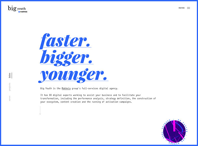
1) Bold Typography
More and more companies are turning to big, bold typography to anchor their homepages. This style works best when the rest of the page is kept minimal and clean, check out this example from French agency Big Youth.
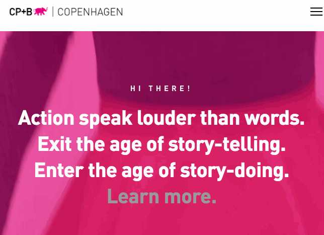
2) Cinemagraphs
Cinemagraphs — high-quality videos or GIFs that run on a smooth, continuous loop — have become a popular way to add movement and visual interest to otherwise static pages. As a result, full-screen loops, like this stunning example from Danish agency CP+B Copenhagen, are sure to hold visitors’ attention for longer than a quick glance.
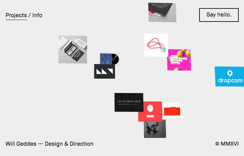
3) Experimental Compositions
To stand out in a sea of tidy masonry style layouts, some designers are opting instead for more eclectic structures. As such, design director Will Geddes displays samples of his work in this unexpected collage of overlapping images.
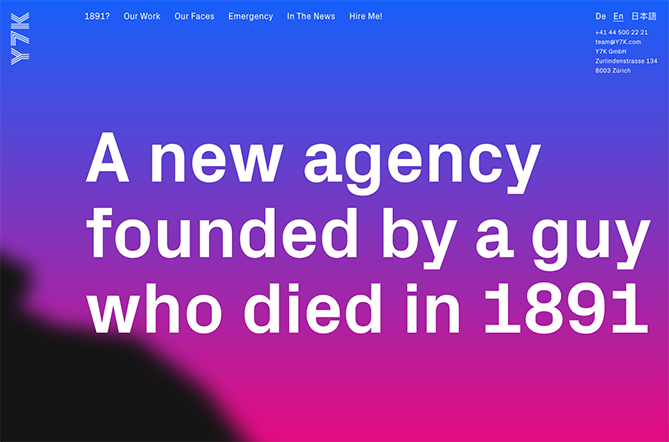
4) Bright Gradients
Kaleidoscopic gradients are coming back in a big way. Zurich-based agency Y7K illustrates a perfect example of how to make this two-tone effect look fresh and modern, with their full-screen, gradient-washed homepage.
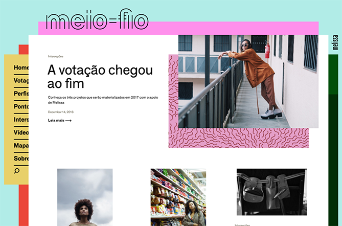
5) Vivid Layers of Color
Staggered, stacked layers of color add depth and texture to a simple site layout, as seen in this stylish example from the São Paulo-based team behind Melissa Meio-Fio.
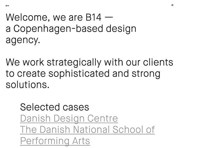
6) Straightforward, Simple Text
Some websites are cutting out images and prominent navigation sections altogether, relying on a few choice lines of straightforward text to inform visitors about their company.
Danish agency B14 uses their homepage real estate to simply describe their mission statement and provide links to samples of their work. It’s a modern, uncluttered approach to presenting information.
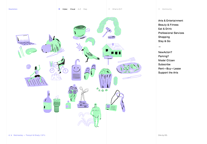
7) Illustration
More companies are turning to illustrators and graphic artists to create bespoke illustrations for their websites. After years of flat design and minimalism, adding illustrated touches to your site is a great way to inject a little personality, as seen in this charming example from NewActon (designed by Australian digital agency ED).
8) Ultra-minimalism
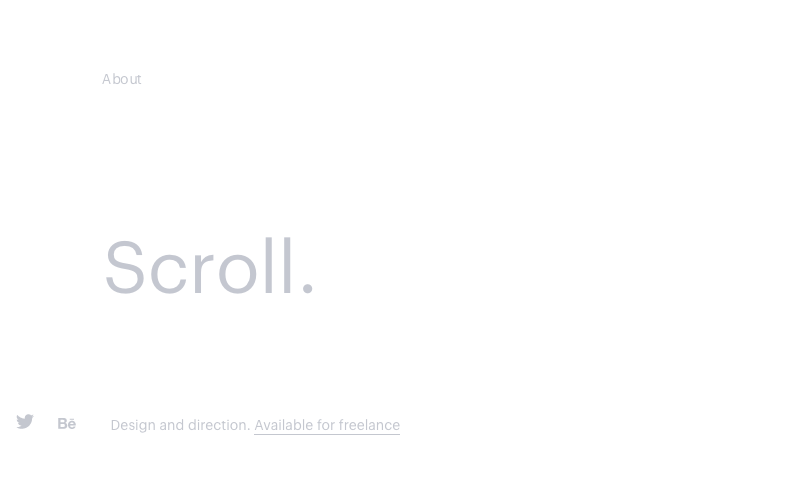
Taking classic minimalism to the extreme, some designers are defying conventions of what a website needs to look like, displaying just the absolute bare necessities. The site from designer Mathieu Boulet is centered around a few choice links to his social profiles and information.
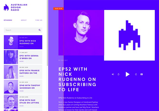
9) Duotone
These parred-down, two-tone color schemes look cool and contemporary, like this example from Australian Design Radio.
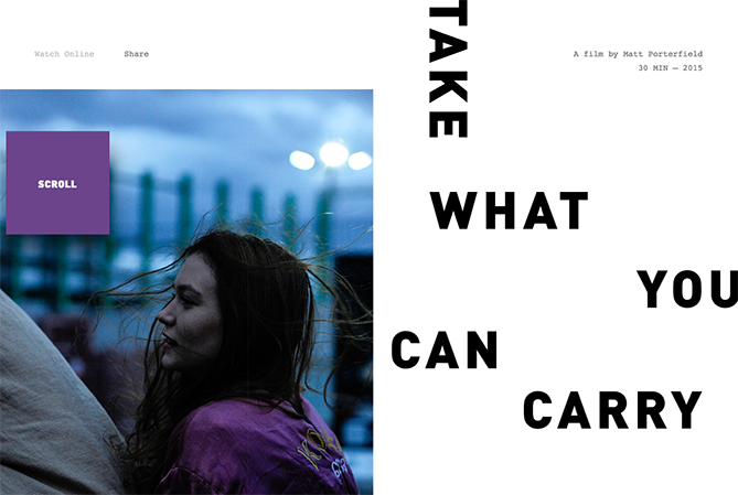
10) Mixing Horizontal and Vertical Text
Freeing text from its usual horizontal alignment and placing it vertically on a page adds some refreshing dimension. Take this example from director Matt Porterfield, which mixes horizontal and vertical text alignments on an otherwise very simple page.
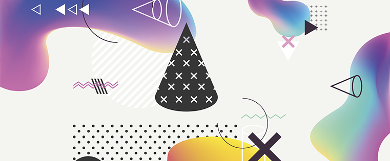
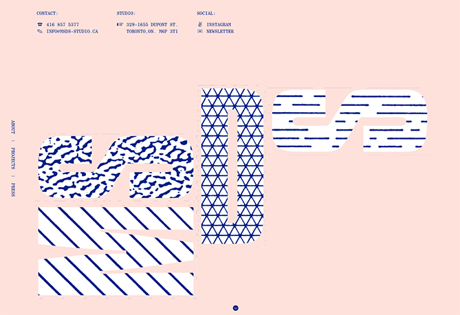
11) Geometric Shapes and Patterns
Whimsical patterns and shapes are popping up more frequently on websites, adding some flair in a landscape otherwise ruled by flat and material design. Canadian design studio MSDS uses daring, patterned letters on their homepage.
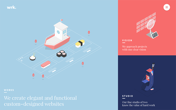
12) Modular Design
Modular design is certainly sticking around in 2017. It’s a foolproof way to create a clean, accessible website that keeps visitors interested. This example from design studio Waaark offers a twist on modular design: When you hover over the dividing edges between modules with your cursor, you produce an unexpected ripple effect.
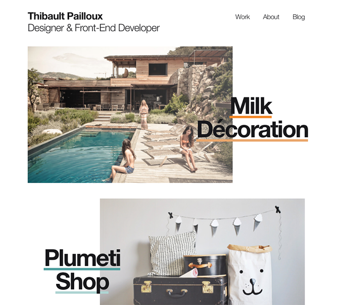
13) Overlapping Text and Images
Text that slightly overlaps accompanying images has become a popular effect for blogs and portfolios. Freelance art director and front-end developer Thibault Pailloux makes his overlapping text stand out with a colorful underline beneath each title because, well… it’s awesome that’s why.
What web design trends do you think will really take off in 2017?